Damage 2
Heavyocity
Services
Creative Direction
Brand Identity
Art Direction
UI Design
Motion Design
3D / VFX
Summary
Developing a visual identity, UI design, product trailer and motion graphics package for the sequel to virtual instrument-maker Heavyocity's flagship drum sample library

Challenge
After having worked with audio software giant Heavyocity on the user interface design for their avante garde piano instrument—Ascend: Modern Grand—we instantly knew that there was a strong creative connection and more collaborations in store.

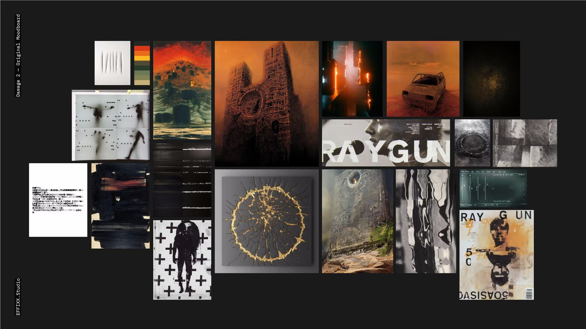
When the time came to develop the sequel to Damage, their flagship percussion toolkit, we were challenged to update the iconic visual identity and UI design with a modern look and feel. Audiences have come to know the Damage aesthetic as aggressively decayed, with utterly destroyed and filthy textural environments. The brief called for exploring a "grown up" evolution of the dystopian identity, while keeping the warm red/orange palette that are instantly recognizable from the product.
Approach
Immediately, we were inspired by the surreal dystopian horror of Polish painter/sculptor Zdzisław Beksiński. His use of warm desert-like landscapes coupled with cold, alien architectural materials and figures were a perfect reference point for building the conceptual world that Damage 2 could live within. The type, layout, and compositional aspects of the brand identity and UI were heavily-inspired by seminal graphic designer David Carson and his late 90's / early 2000's work as art director for music and culture magazine Raygun.
The Trailer
:60 Launch Promo
To announce the Damage 2 launch, we produced a :60 product trailer teasing the look and sound of the new instrument. The spot was built from a combination of CG and in-camera practical fx: fluids, dust, and hand-scanned frame-by-frame sequences.


User Interface
Rich Textures and technical Detail
To capture the kind of patina and decay we were looking for, EFFIXX turned to destroyed tintype plates for the base layers. Feature knobs and animated controls were rendered in 3D using scanned textures. Damage 2 is built within the Native Instruments Kontakt player, so we worked around constraints by distributing features across multiple UI tabs/sections.
‍‍

Logo & Typography
Analog Damage & Texture
EFFIXX approached type styles and the logo itself by developing a set of black & white and color treatments which had been destroyed by hand using flatbed scanner and xerox textures.  
‍‍

Motion Package
Title Slates, templates & Toolkit
We developed a set of slates, a toolkit of textural treatments, and an Adobe Essential Graphics / Motion Graphics Templates toolkit — enabling in-house editors and video producers to build on-brand content right inside of Adobe Premiere, minimizing time spent editing graphic source files.


Textures & Practical VFX
Behind the Scenes
All textures used throughout the UI and video content were captured in-studio. Here's a peek at some of the source material created during that process.


The Result
Damage 2 has been highly-anticipated by its' composer audience and the reviews and testimonials show that it was not only well-received as a product, but the enthusiasm around the visual design and promotional materials made the launch a huge success.